The Data Platform Behind 32,000 Advertising Accounts
TL;DR
I designed 400+ screens for J+Lake, the foundational data platform powering Jellyfish's entire product suite. It manages data collection, pipeline monitoring, and client onboarding across 22 connectors, 8 products, and 20,000+ daily jobs for 500+ clients and 32,000+ accounts. I built the research infrastructure from scratch, designed unified experiences for three distinct user roles, and achieved an 8.9/10 usability score with 100% task completion.
Context
Jellyfish is a global digital media company serving enterprise clients through data-driven marketing services. The company operates a suite of interconnected data products: J+IQ for competitive analysis, J+Bidding for ad spend optimization, Share of Model for AI brand analytics, and others. All of them depend on a shared data infrastructure for their underlying data collection, processing, and delivery.
That infrastructure is J+Lake. It collects data from 22 advertising and analytics connectors (Google Ads, Search Ads 360, Display and Video 360, Campaign Manager 360, and 18 others), processes 20,000+ data collection jobs daily, and manages the credentials, templates, and monitoring systems that keep the data flowing for 500+ clients across 32,000+ accounts.
This is not a user-facing analytics tool. It is the foundational layer that every other product depends on. When J+Lake breaks, everything downstream breaks: reports fail, dashboards go dark, client deliverables miss deadlines.
The Challenge
Technical fragmentation: 22 data connectors, each with different data models, authentication methods, and operational patterns. Google Ads handles credentials differently than SA360. DV360 uses different scheduling cadences than CM360. Templates run at frequencies ranging from every 15 minutes to weekly, each with different error states, retry logic, and monitoring needs. The platform had to present a unified experience across all of this.
Three distinct user roles: CSMs (Customer Success Managers) think in terms of clients and accounts: they need to validate credentials, link advertising accounts, and manage multi-connector setups. Data Engineers think in terms of templates and pipelines: they build, modify, and monitor data collection templates, troubleshoot failures, and manage scheduling. Paid Media Specialists think in terms of campaigns and performance: they navigate client data to optimize advertising spend. A single platform had to serve all three without forcing any role into an unnatural workflow.
Scale: Client lists run to hundreds of entries. Template tables show 100+ linked clients per template. Monitoring dashboards need to surface meaningful signal from thousands of daily jobs. Every decision about what to show, what to hide, and how to organize affects whether a CSM can find a problem before it cascades into a client escalation.
And users were uncertain about the tool's purpose. Feedback indicated that people did not understand how J+Lake would integrate with their daily responsibilities.
My Role
Title: UX Designer
Actual scope: Lead product designer for the entire J+Lake platform -- end-to-end ownership of discovery, research infrastructure, design, and usability testing across all user roles
Team: Cross-functional collaboration with product owners, tech leads, and developers; I was the sole design authority
Strategic influence: Developed a Tech/UX/Business review prioritization framework that directly influenced the product roadmap
Research and Discovery
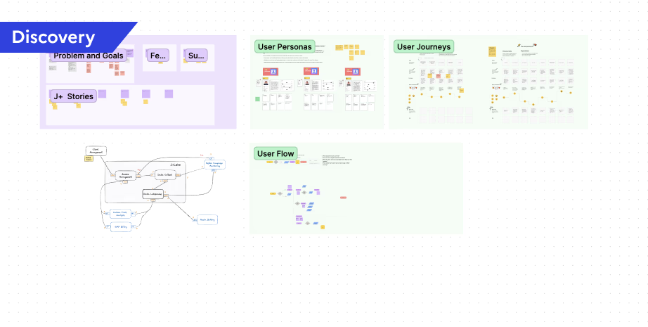
I designed a structured discovery questionnaire covering six theme areas: data collection monitoring priorities, automated health check workflows, template management, historical data usage patterns, template discovery and organization, and template quantity and customization needs. The questionnaire went through iterative refinement, testing question phrasing to ensure I captured actionable insights rather than generic feedback.
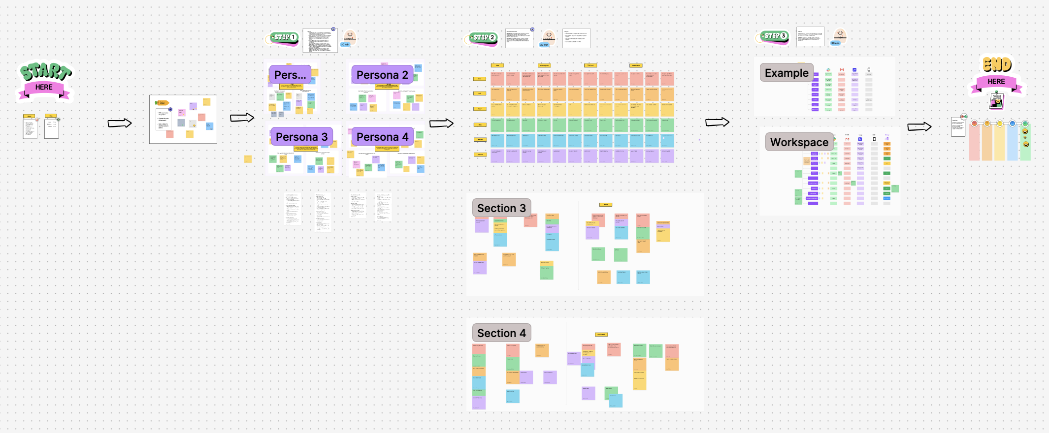
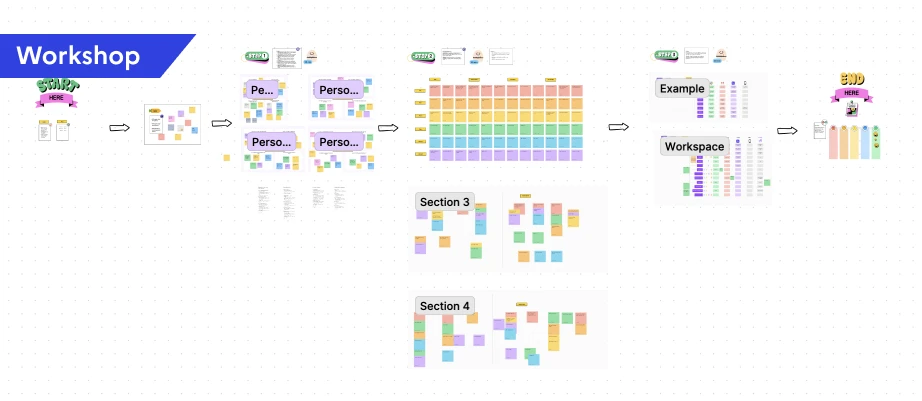
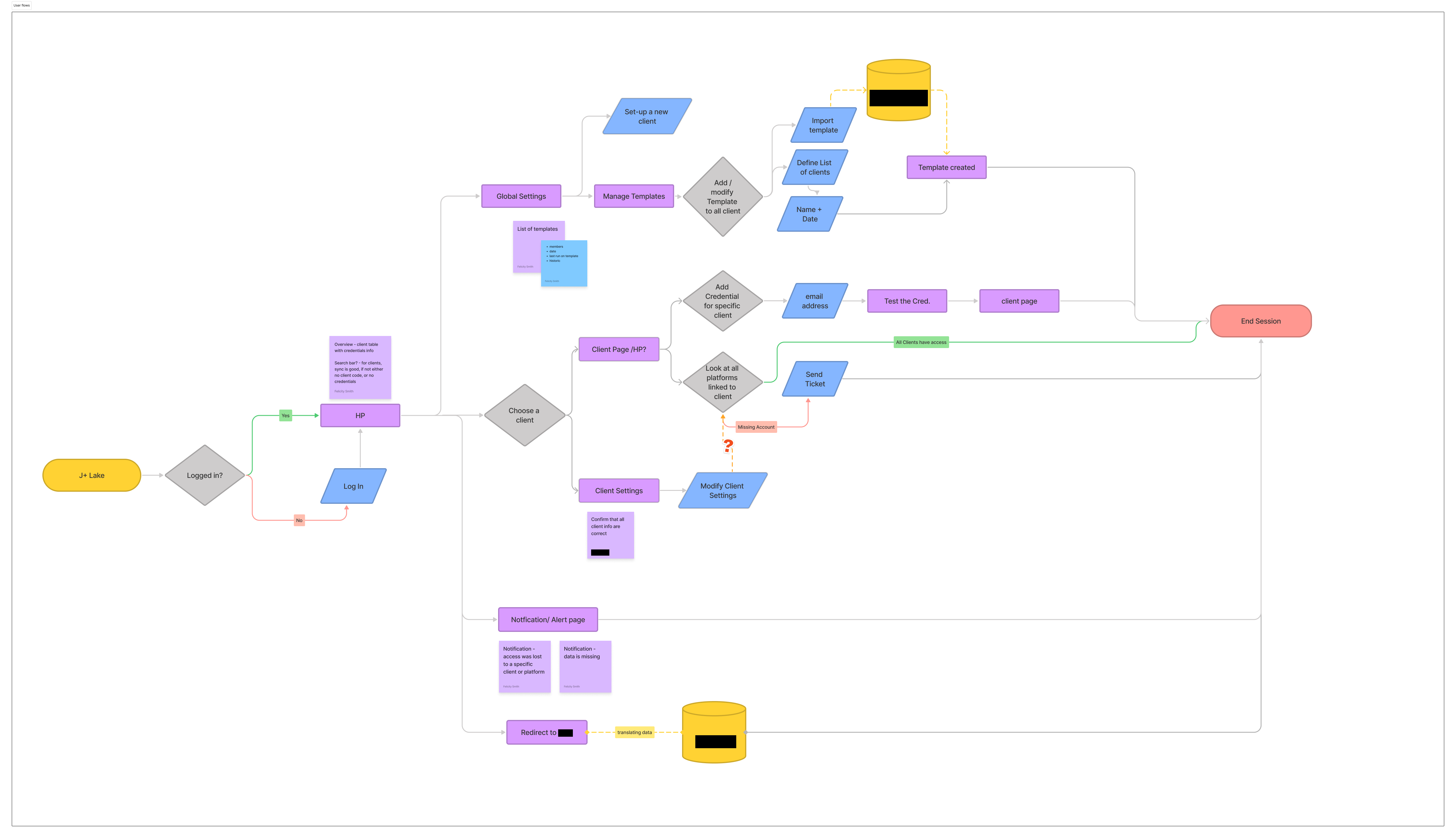
I facilitated workshops that progressed from understanding users to understanding their workflows to designing solutions. I created persona cards for 4 user types, mapped user journeys for each role, developed user stories, and designed user flows. Each step informed the next.
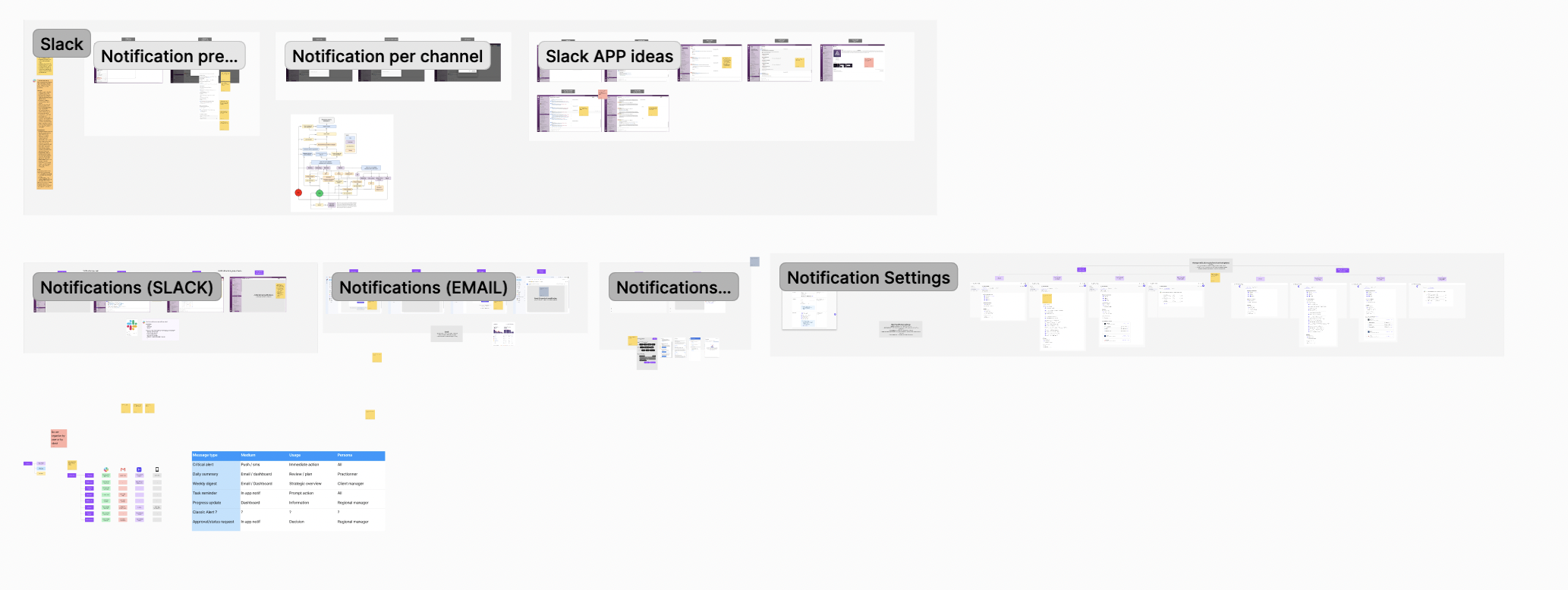
Notification System Workshop
For the notification system, I ran a dedicated workshop with data engineers, data analysts, CSMs, tech leads, the product owner, and account managers. The workshop moved through five stages:
- Empathy mapping for each user persona to understand their unique notification needs
- Crazy 8 brainstorming for rapid idea generation per persona, producing a wide range of notification concepts
- Grouping and theming to categorize ideas by similarity
- Defining notification mediums to determine the right delivery method for each type (Slack, email, in-platform)
- Prioritization by importance and urgency
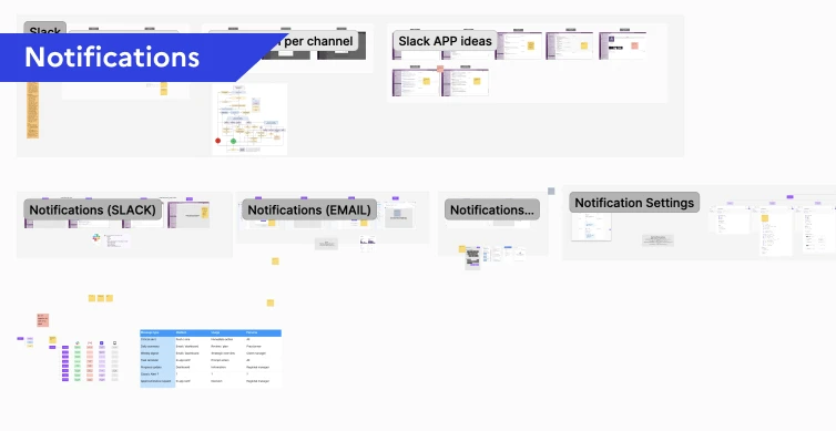
The workshop output directly shaped the design: an Admin settings panel allowing super admins to customize notifications by role and channel. For example, when a new account is added, the responsible CSM receives a direct Slack message, the update appears in a weekly digest for all CSMs, and it triggers a high-priority alert in the platform.
Template Management Research
Template management went through surveys, user interviews, wireframes, user tests, and expert round tables. The key insight was that not all connectors are equal in complexity. I categorized them into three levels:
- Level 1 APIs (e.g., DV360): Metrics and dimensions are provided by the platform. Straightforward setup.
- Level 2 APIs (e.g., Meta): Requires a stream. Data engineers need to identify viable metrics and dimensions combinations and need a testing space to validate them.
- Level 3 APIs (e.g., Google Analytics): Client-specific configuration requiring detailed objectives, often needing developer input for setup.
The goal was to reduce the load on data engineers by making templates accessible to other profiles like product owners and data analysts. Phase 1 focused on CSV upload and an open space for string uploads, with documentation that changed based on the connected source. We then built a library for each source, providing dropdown menus with relevant metrics and dimensions, including a reactive function to disable incompatible choices. The Test button let users validate their setups before publishing. This system saved engineers hours of research and testing.
Usability Testing
I created dedicated test scripts for each user role with defined objectives, step-by-step instructions, and expected outcomes across 5 test scenarios. For CSMs: client validation workflows, verifying credentials across CM360, DV360, Google Ads, and SA360, linking and unlinking accounts, managing account transfers, identifying error states. For Data Engineers: template management and monitoring. For Paid Media Specialists: navigation and data access.
I conducted 20-minute remote usability testing and in-person interviews with 5 users across all three roles (2 CSMs, 2 Data Engineers, 1 Paid Media Specialist). Findings were organized by category (UI/UX, Template Management, Data Management, System Features, Security) with quantified metrics, user quotes, and prioritized recommendations.
Design Process
Designing for Three Mental Models: The core design challenge was creating a unified platform that respected each role's mental model without fragmenting into three separate products. My approach was to design shared infrastructure (navigation, visual language, interaction patterns) that maintained consistency with the broader J+ product suite, while creating role-specific workflows within that shared framework.
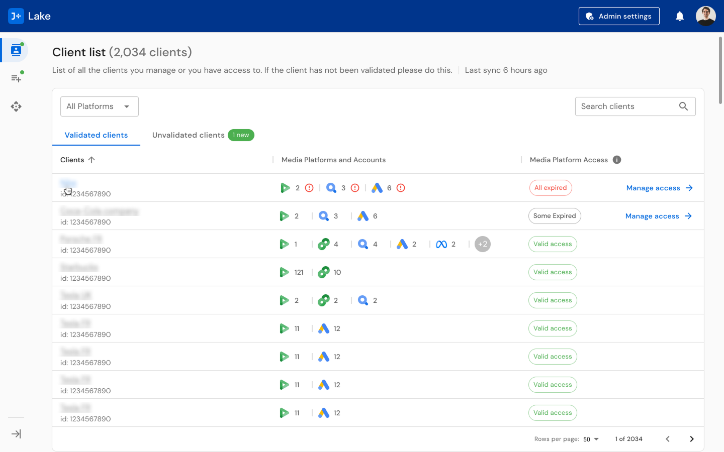
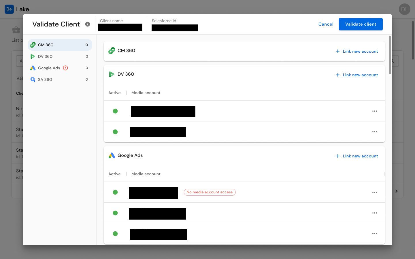
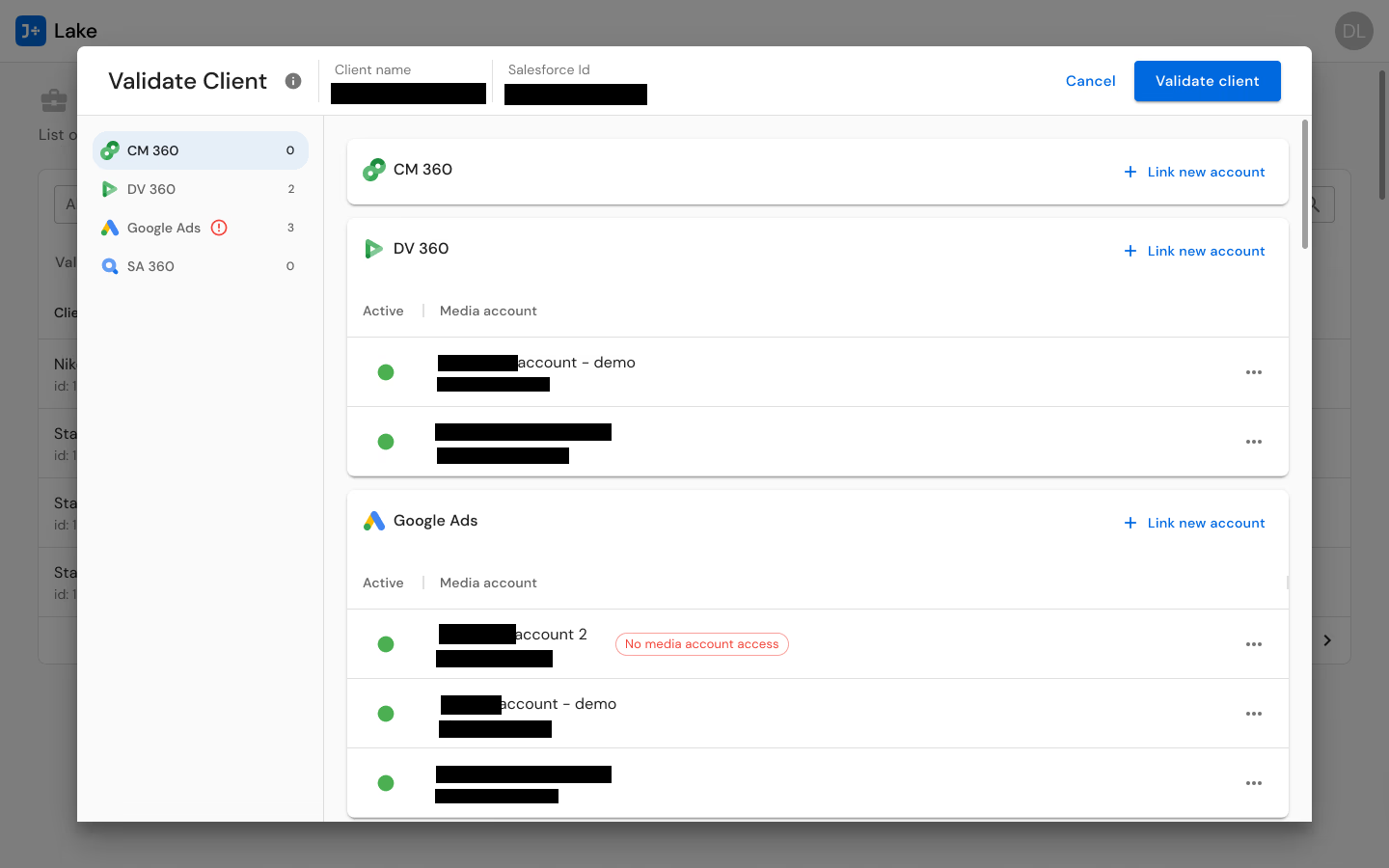
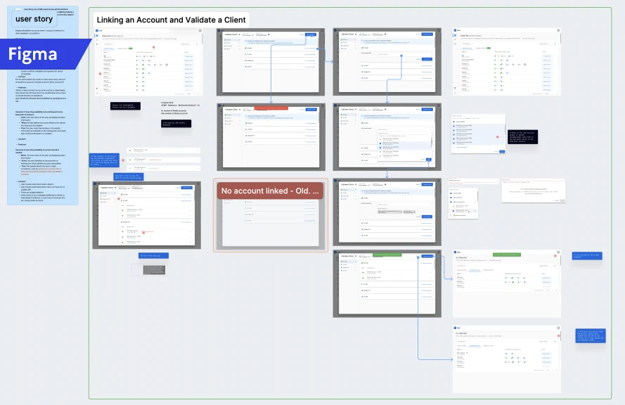
For CSMs, I designed client validation flows that mirror their account-management mental model. The Validate Client interface presents multi-connector account management for CM360, DV360, Google Ads, and SA360 in a unified view -- allowing CSMs to see all of a client's connected accounts, their status, and any credential issues in one place. Account actions (transfer, unlink, add) are contextual to each connector, because different connectors have different requirements, but the interaction pattern is consistent.
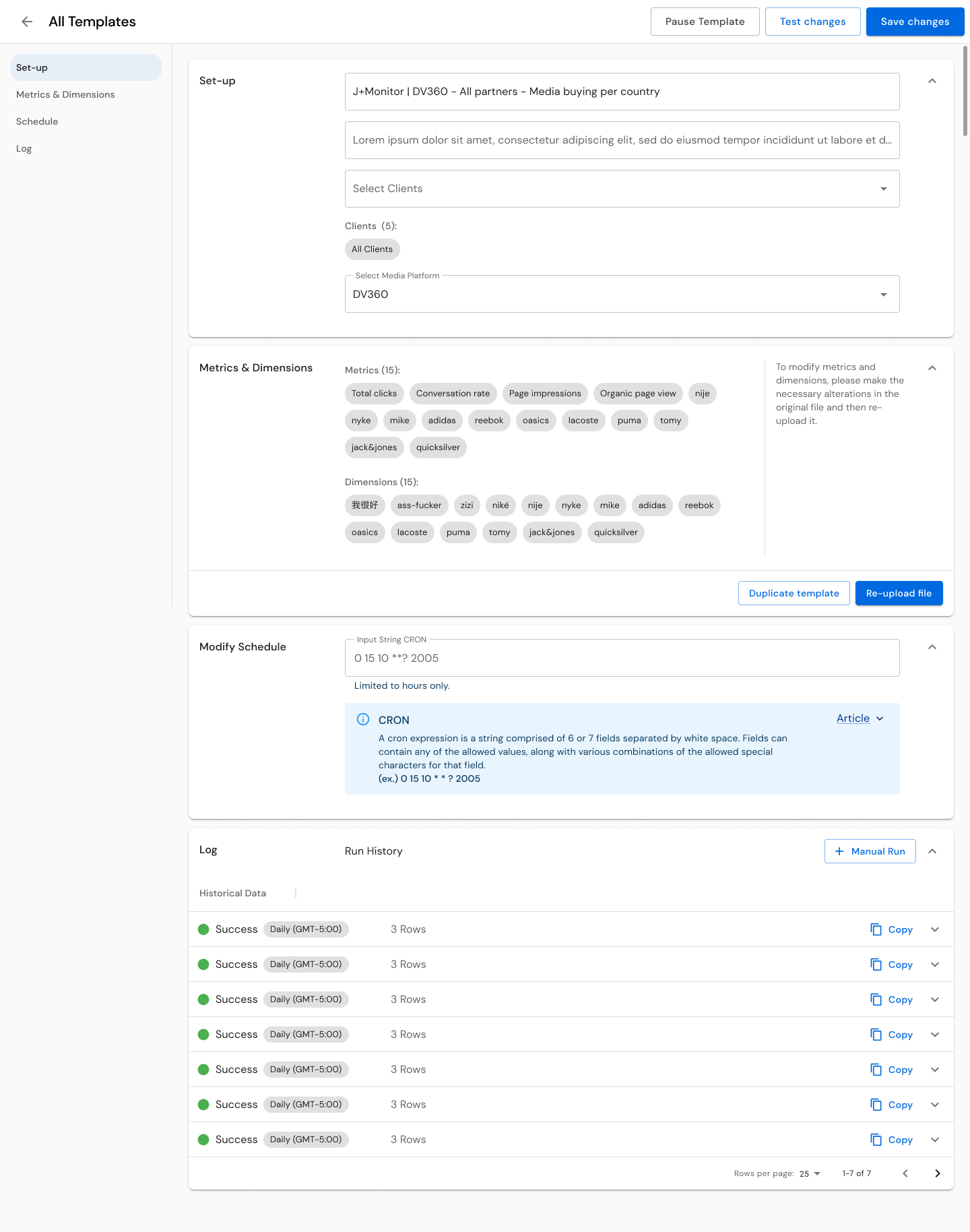
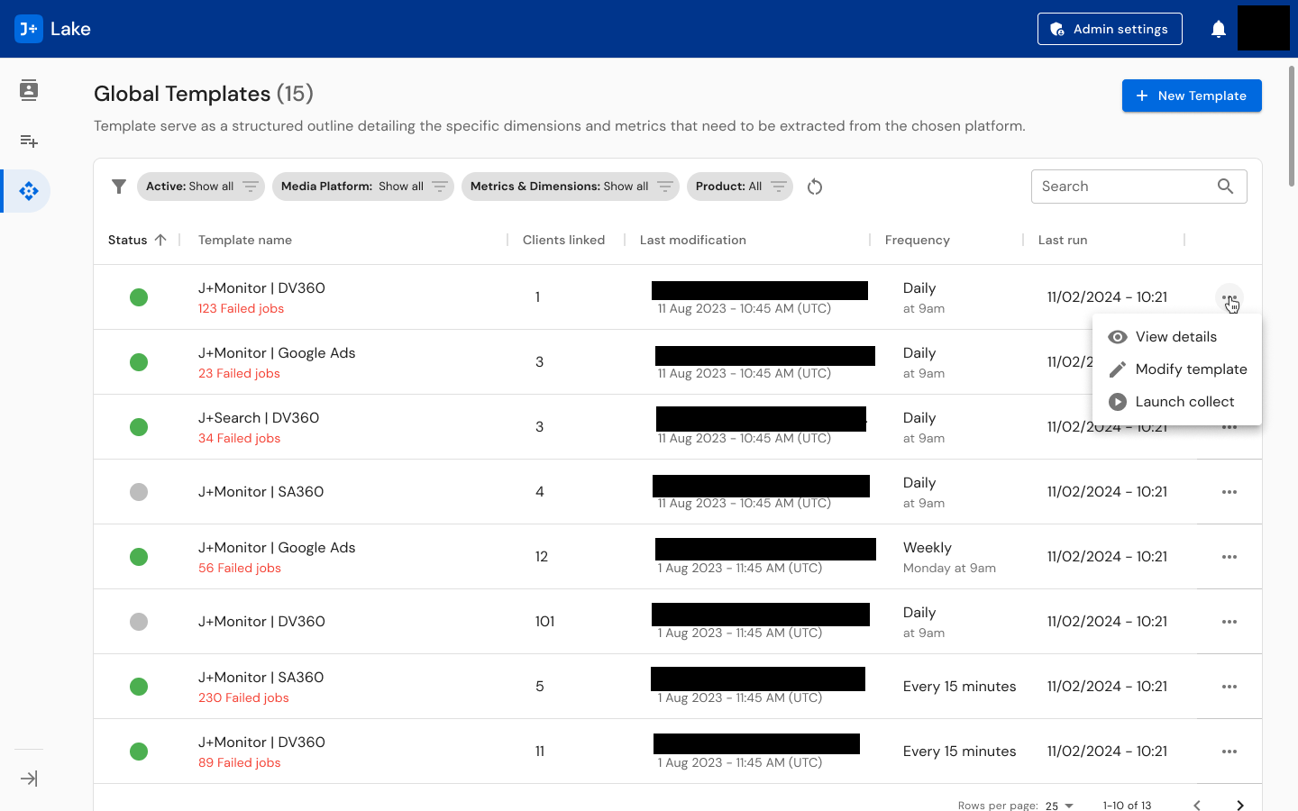
For Data Engineers, I designed template management systems with the depth they need -- scheduling controls (from every 15 minutes to weekly), modification tracking, run history, linked client visibility (showing templates serving 1 to 101+ clients), and status indicators. The template list shows 15+ global templates with filtering by status, product, modification date, and frequency. The three-level complexity model (L1/L2/L3) informed how much guidance and tooling each connector's template creation flow provides, with the metrics and dimensions library, incompatibility detection, and test function built into the workflow.
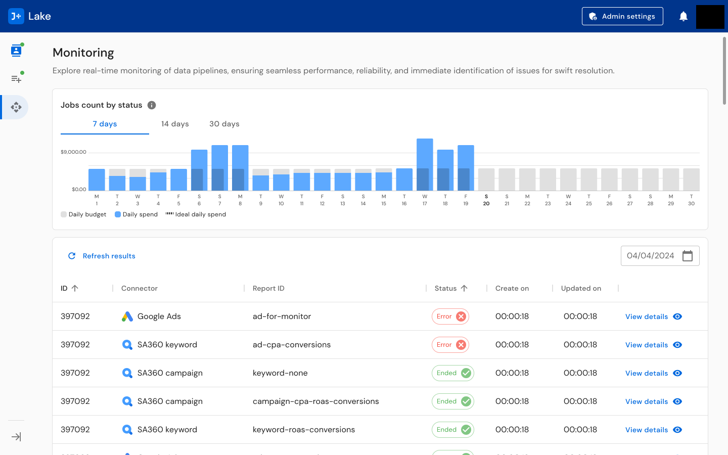
For operational oversight, I designed monitoring dashboards that surface real-time pipeline status: jobs count by status with daily budget/spend/ideal spend charts, a detailed job table with status indicators (active, paused, error, ended), connector-specific views, and notification systems across Slack and email. The monitoring view answers the question every operations person asks first: "Is anything broken right now?"
The Notification System: Data pipeline monitoring demands proactive alerting. I designed a multi-channel notification system spanning Slack (per-channel alerts and dedicated Slack App concepts), email notifications, and a centralized notification settings interface. The Admin settings panel allows super admins to customize notifications by role and channel -- ensuring the right people get the right alerts through the right medium.
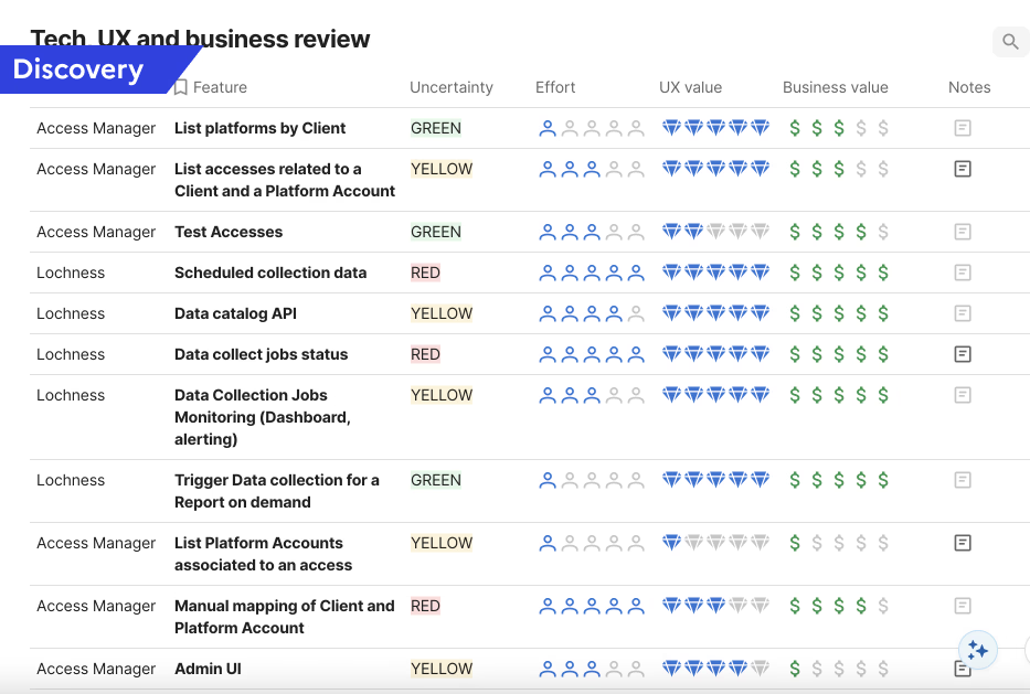
Influencing the Product Roadmap: Beyond interface design, I developed a Tech/UX/Business review prioritization framework that evaluated each feature across four dimensions: Uncertainty (Green/Yellow/Red), Effort, UX Value, and Business Value. I applied this framework to 10+ features including platform account listing, access testing, scheduled collection monitoring, data catalog API, manual mapping, and admin UI. This tool translated UX research insights into a format that product and engineering could use for roadmap decisions, bridging the gap between what users needed and what got built.
Solution
The delivered J+Lake platform spans 400+ screens unified under a coherent design language:
Monitoring Dashboard: Real-time pipeline monitoring with jobs count by status visualization (active, paused, error, ended), daily budget and spend charts, detailed job tables with inline status indicators, and connector-specific filtering. Designed to answer "is anything broken?" within seconds of opening.
Template Management: Comprehensive template creation, modification, and monitoring system across three complexity levels. Templates display linked client count (1 to 101+), scheduling frequency (15 minutes to weekly), last run timestamp, modification history, and status. Supports creation, duplication, editing, and archiving workflows. Includes metrics and dimensions library with incompatibility detection and a test function for validation before publishing.
Client Validation: Multi-connector credential management enabling CSMs to verify, link, unlink, and transfer advertising accounts across Google Ads, SA360, DV360, and CM360. Validates credentials per connector, shows account status, and surfaces error states requiring attention.
Notification System: Multi-channel alerting across Slack (per-channel and dedicated app) and email, with centralized Admin settings for controlling notification preferences, thresholds, and routing by role.
Unvalidated Client Management: Dedicated workflows for identifying and resolving clients with missing, expired, or invalid credentials -- preventing data collection failures before they impact downstream products.
The design maintains visual consistency with the broader J+ product suite (navigation patterns, card-based layouts, icon language, typography) while accommodating the infrastructure-specific demands of data pipeline management. Users transitioning between J+Lake and other J+ products encounter familiar patterns.
Results
400+
Screens designed
22
Data connectors unified
500+
Clients supported
32,000+
Accounts managed
20,000+
Daily jobs processed
- 8.9/10 average usability score across all three user roles with 100% task completion
- Users praised the unified experience: "It is surprising how different sources have different ways of being connected, and here everything is streamlined and easy to set-up. It is easy to manage so that even non tech people or experts can manage them. Really useful for CM or CSM."
- Data engineer on templates: "I needed documentation and help with the metrics; having a library would be great, but documentation for a first step was amazing. Also, the testing feature is a game-changer."
- Tech/UX/Business review framework directly influenced the product roadmap, translating UX insights into prioritized engineering work
Reflections
J+Lake sits in a different category from the other products I designed at Jellyfish. J+IQ and Share of Model are tools people interact with directly -- tools they open, explore, and make decisions from. J+Lake is infrastructure. Most of its value is invisible. When it works well, nobody notices. Its success is measured not in delight but in the absence of failure.
That shaped every design decision. Every workflow had to account for error states, edge cases, and scale implications that would never surface in a prototype walkthrough but would absolutely surface at 20,000 daily jobs. The monitoring dashboard needed to surface the one failing pipeline among thousands of healthy ones. The client validation flow needed to handle the case where a credential expires mid-collection across multiple connectors simultaneously.
The other thing that defined this project was designing across mental models. CSMs, Data Engineers, and Paid Media Specialists do not just have different tasks -- they think about the same system in fundamentally different ways. The information architecture decisions I made (how to structure navigation, what to show on each view, how to organize filtering) had to serve all three without defaulting to the vocabulary or priorities of any single role. The 100% task completion rate across all roles tells me those decisions worked.
Core patterns this project demonstrates
- Territory Mapping: Systematic discovery across 6 theme areas with role-specific research instruments before designing -- understanding the 22-connector ecosystem, 3 user roles, and their distinct workflows before proposing any solution
- Infrastructure Building: Research questionnaires, role-specific test scripts, structured findings frameworks, and a Tech/UX/Business prioritization framework -- all built from scratch as reusable research methodology infrastructure
- Silo Bridging: Designing a unified platform that bridges three organizational functions (CSMs, Data Engineers, Paid Media Specialists) with fundamentally different mental models and workflows
- Operating Above Title: 400+ screens of enterprise data platform design, research practice building, and product roadmap influence as a UX Designer
J+Lake is also the foundation that every other Jellyfish product depends on. I designed the interconnected system, not just individual products. J+Lake feeds J+IQ, SOM, J+Bidding, and the rest of the suite. Understanding that ecosystem -- how data flows from connector to template to pipeline to product -- is what made it possible to design coherent experiences across the entire J+ platform.
Key Artifacts
Related Case Studies
See all projectsJellyfish / BrandTech Group
Automating analyst workflows across 3 internal products
Three internal tools, one common pattern: replacing manual processes with designed interfaces. J+IQ cut competitive reports from 72 hours to 15 minutes, saving 1,000+ hours across 130 users. J+Bidding replaced a 5-hour API process with a 1-minute interface, supporting $800K+ in revenue. J+Carbon shipped a carbon footprint calculator in under two months.
Workflow AutomationMarigold (now Zeta Global)
Establishing UX research infrastructure across 6 products
Six enterprise products, no shared research practice. Built the infrastructure from scratch: UX Foundations for five products, methodology guides, a research portal, standardized processes. Over 20 independent research efforts in eight months, now used independently by the full UX team and 15+ product managers.
Research Infrastructure