Leading Design Through a $325M Acquisition
TL;DR
During Zeta Global's acquisition of Marigold's enterprise business, I moved from Senior Product Designer to interim design lead for a team of 6 across 6 products and platform initiatives. I restructured how designers are assigned to products, led a three-phase rebrand, migrated 250+ Figma accounts into the Zeta org, standardized the design-to-engineering process, and now run performance reviews, budgeting, and roadmap planning.
Context
In September 2025, Zeta Global announced the acquisition of Marigold's enterprise software division for up to $325 million. The deal covered six products -- Loyalty, Cheetah Digital, Selligent, Sailthru, Liveclicker, and Grow -- serving 100+ global enterprise brands including 40+ Fortune 500 companies. Campaign Monitor, Emma, and Vuture stayed with Marigold.
I had been at Marigold since February 2025 as a Senior Product Designer. By the time the acquisition closed at the end of 2025, I was responsible for design across all six products. In November, the design leadership role opened up as part of the transition and I was asked to step in.
Three of the six products were also being integrated into ZMP (Zeta's core marketing platform), so on top of the transition work, the product roadmaps were already heavy.
The Challenge
The design team I inherited had structural problems that predated the acquisition:
- Siloed designers: Each designer was assigned to a single product and worked in isolation. No support structure, no cross-product visibility, no mechanism for sharing knowledge or solutions.
- No shared process: Every product team had a different way of working with UX -- different handoff expectations, different meeting cadences, different definitions of when design was "done." Nobody knew exactly what they were responsible for.
- Multiple design systems in different states: Some products had their own design systems, several shared one called Console Kit, and many had legacy UI that predated any system. Console Kit itself had structural issues -- light/dark mode wasn't properly separated, causing accessibility problems.
- Broken communication loops: On some products, design-to-engineering handoff for simple features was taking months. Backlogs had grown unchecked.
The acquisition added urgency to all of this. Six products needed to rebrand to Zeta while three were simultaneously integrating into ZMP. The Figma infrastructure needed to migrate to a new org. And the team needed to keep shipping against full product roadmaps through all of it.
My Role
Title: Interim Design Lead (previously Senior Product Designer)
Team: 6 designers -- 3 Senior Product Designers, 2 UX Designers, 1 UX Researcher -- spread across Europe, India, and the US. Product and engineering teams extend further into New Zealand and Australia.
Scope: 6 products plus platform initiatives (analytics dashboards, app switcher/Zeta ID, cross-product systems). Each product has 1-4 product managers. I took on weekly design reviews, 1:1s, roadmap planning, work distribution, performance reviews, budgeting, and reporting to the CPO.
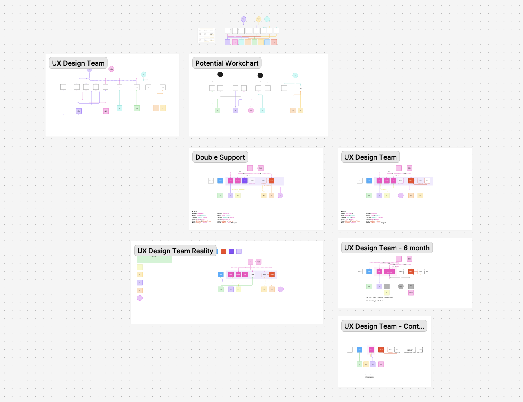
Team Restructure
When I took over, each designer was assigned to a single product and most of them worked in isolation. If a designer was stuck or overwhelmed, there was no support structure. If a product needed a skill set the assigned designer didn't have, it just didn't happen. The weekly team meeting was one designer presenting a project -- the rest watched.
I restructured the team into paired assignments: a lead designer per product with a second designer supporting. I mapped the pairings based on three things:
- Skill match to product need: Which products needed heavy research vs. UI overhauls vs. architecture work, and which designers were strongest in each area.
- Time zones: The design team is in Europe, India, and the US, but product and engineering teams also span New Zealand and Australia. I paired US West Coast designers with APAC-based product and engineering teams so they had overlapping hours.
- Language: One product's main customer base is French-speaking. I focused our Belgian UX researcher -- who speaks French -- on that product so he could work directly with those users.
Designer A and Designer B: One designer (Designer B) had been solo on their product for years. The backlog had grown to 40+ outstanding tickets. Communication with Product and Engineering had broken down, and design-to-engineering handoff for simple features was taking months. Some tickets were two years old with designs that had never been implemented and were now out of date.
I partnered them with Designer A, who had experience with the new process I'd put in place, was strong in UI, and had started using the research methods from the infrastructure I built earlier. That product needed both research and a design system audit -- the pairing addressed both.
They started the new process in January. Together they worked with Product to restructure the backlog -- what was still applicable, what was out of date, what was missing design briefs, what could be done quickly. They each targeted three to four backlog tickets per week. By March, they had cleared most of the backlog. That product went from 40+ outstanding tickets to four or five active ones.
Cross-Product Design Reviews
I changed the weekly team meeting from single-presenter to a popcorn format where everyone shares what they're working on. We started prioritizing initiatives with cross-product implications.
RCS is one example. Two designers on two different products -- Selligent and Cheetah Digital -- had each designed RCS solutions independently with different approaches. Sailthru was about to start looking at RCS too. Instead of a third isolated effort, we ran collaborative design reviews across the teams so they could compare solutions and pull from the strongest parts of each. We ran research that spanned both products so the findings could be compared and contrasted.
Designers who were stronger in specific areas started consulting with other teams. The result was that people who had been siloed for years started seeing patterns across products -- similar problems showing up in different places, solutions that could be reused or adapted. They also got practice presenting and explaining their design decisions in the reviews, and that carried over into how they communicated with their own product teams. It became easier for them to explain what they'd done and why, which helped when product or engineering pushed back.
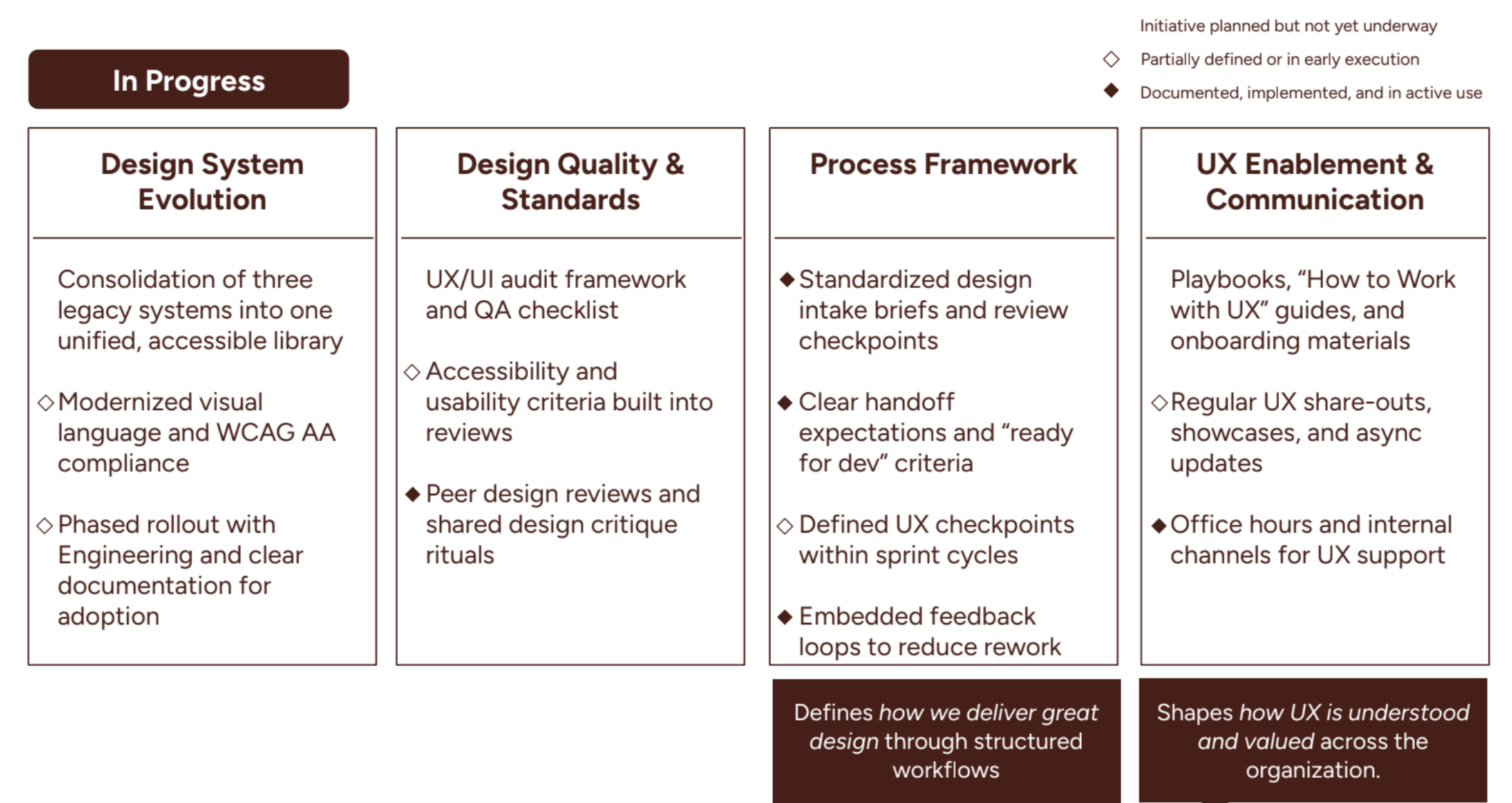
Process Standardization: The Phase Playbook
Each product team had a different way of working with UX -- different handoff expectations, different meeting cadences, different definitions of when design was "done." Nobody knew exactly what they were responsible for or when other teams were supposed to be involved.
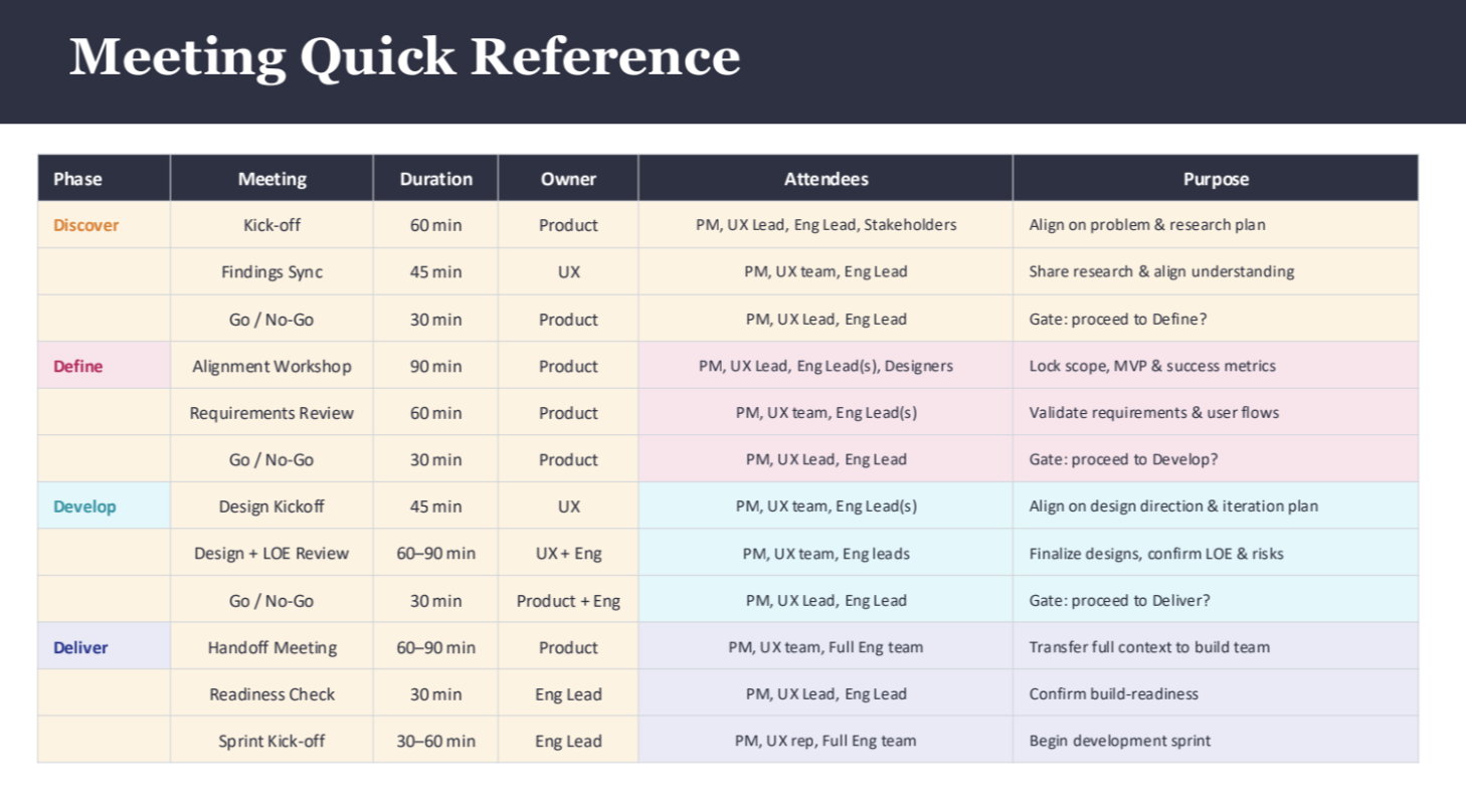
I built a Phase Playbook -- a four-phase process that defines how Product, UX, and Engineering work together from problem identification through build-ready handoff. Typical timeline is 4-8 weeks across all phases. The four phases:
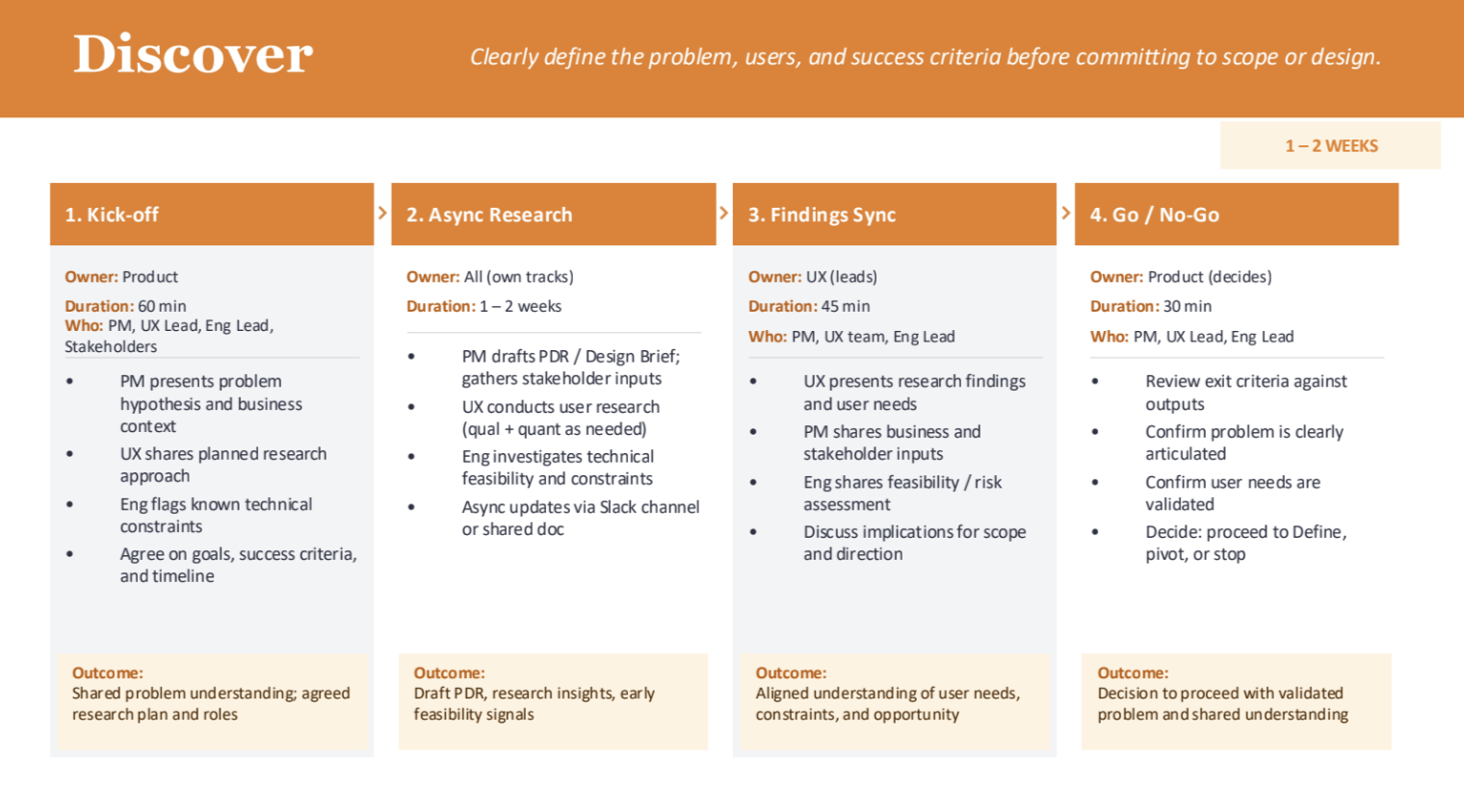
- Discover (1-2 weeks): What problem are we solving? Product owns the problem framing and drafts the Design Brief. UX plans and runs research -- interviews, data analysis, pain point validation. Engineering flags known technical constraints early. The phase ends with a Go/No-Go: is the problem clearly articulated, are user needs validated, are success metrics agreed?
- Define (1-1.5 weeks): What are we building? Product translates discovery insights into requirements, defines MVP and in-scope vs. out-of-scope. UX defines core user flows and experience principles at low fidelity. Engineering reviews for feasibility and surfaces dependencies. The phase ends with scope locked and Jira tickets written.
- Develop (2-3 weeks): How will it work and can we build it? UX creates wireframes and iterates to final designs with regular design reviews (2x/week). Engineering runs technical discovery, spikes, and LOE estimation in parallel. Product makes tradeoff decisions as constraints emerge. The phase ends when designs are finalized, requirements reflect the final designs, and LOE is complete.
- Deliver (0.5-1 week): Are we ready to build? Formal handoff meeting where UX walks through final designs, interactions, states, and edge cases. Product finalizes acceptance criteria and prioritizes the backlog. Engineering breaks work into implementation tasks and confirms resourcing. The phase ends with a sprint kick-off.
Every phase follows the same rhythm: kick-off meeting, async work streams, sync review, then a Go/No-Go gate. The gates are decisions, not ceremonies -- if exit criteria aren't met, the team iterates instead of advancing. Ownership rotates by expertise: Product owns problem and scope gates, UX owns design direction, Engineering owns feasibility and LOE. No one function dominates every phase.
Having these checkpoints meant engineering got involved earlier, which reduced rework later. Product teams wrote better feature requirements because they had earlier input on what was technically feasible. And the process meant that if a designer was out or on vacation, someone else could pick up the work -- the paired assignments made this possible, but the standardized process made the handoff smooth.
I've implemented this across Loyalty and Sailthru so far and I'm currently rolling it out to Selligent.
The Rebrand
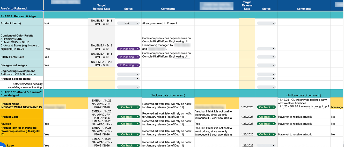
All six products needed to transition from Marigold branding to Zeta. Previously, Marigold had rebranded the products under names like Engage and Engage+ -- now they were reverting back to Cheetah Digital, Selligent, and the original product names under the Zeta umbrella. With three products simultaneously integrating into ZMP and full product roadmaps across the board, we didn't have months to spend on this. I led it in three phases:
- Phase 1 -- Names and logos: New product names and updated logos across all six products.
- Phase 2 -- Colors and fonts: Primary CTAs moved to Zeta blue. H1s and H2s moved to Lato (defined by point size: anything 40pt or 32pt became Lato). This also covered the help center website -- new fonts, colors, and brand alignment.
- Phase 3 -- Patterns and systems: Introducing more established UI patterns and shared components across products.
The strategy was to design for the 80% globally and handle the 20% outliers per product. We applied the color and typography changes as a global update, then each product team ran an audit and came back with specific cases where it wasn't working. We made adjustments on a case-by-case basis. Almost everything else stayed product-specific -- the goal was to give the look and feel of Zeta without rebuilding each product's UI.
Console Kit: The shared design system used across several products had structural issues beyond the rebrand. It had light mode and dark mode, but when it was originally built there was no clear one-to-one mapping between them -- primaries were shared across both modes, which caused accessibility problems and confusion around click states, hover states, and active states. The system had been engineer-led.
I had the strongest UI designer on the team -- Designer A from the earlier pairing -- create a workshop with the Console Kit team to restructure how colors and states were applied. They established rules for how the system should work in both modes, which the team then applied across the whole design system. It was slightly outside the rebrand scope, but it was work that needed to happen alongside it so that the rebrand changes could be applied consistently.
The platform layer added more phasing complexity. Analytics dashboards span multiple products. The app switcher (previously Marigold ID, now Zeta ID) lets clients who use multiple products log in once and move between them. These shared elements had to be coordinated with each product's release cycle -- and each product shipped on a different cadence.
Phases 1 and 2 were completed within the first two quarters, shipped by April 2026.
Transition Operations
Figma Migration: Marigold's half of the company -- 250+ Figma accounts -- needed to be transferred into the Zeta organization. I coordinated this across Figma, Zeta leadership, the VP of Product Strategy, and IT. The process involved auditing existing licenses, cleaning up unused seats, mapping all users into the Zeta system, creating drafts folders, reorganizing the file structure, and running communication with all Figma users about what was changing and when. I also handled the budgeting side -- negotiating seats, managing the transition costs.
Performance Reviews: I built performance matrices for the team and presented them to the CPO. For each person I documented where they were, where they needed to grow, what their strengths were, and why I'd placed them where I had in the matrix. This was the first structured performance evaluation the design team had gone through under the new org.
Results
6
Products + platform initiatives
6
Designers managed
250+
Figma accounts migrated
40+
Backlog tickets cleared on one product in under 3 months
2
Rebrand phases shipped by April 2026
- Paired assignment model replaced siloed structure -- designers consult across products and cover for each other
- Cross-product design reviews surfaced reusable solutions (RCS across Selligent, Cheetah Digital, and Sailthru)
- Four-phase design process reduced ambiguity between design, product, and engineering -- earlier engineering involvement, less rework
- Console Kit design system restructured: light/dark mode rules, accessibility fixes, clear state definitions
Key Artifacts
Related Case Studies
See all projectsMarigold (now Zeta Global)
Establishing UX research infrastructure across 6 products
Six enterprise products, no shared research practice. Built the infrastructure from scratch: UX Foundations for five products, methodology guides, a research portal, standardized processes. Over 20 independent research efforts in eight months, now used independently by the full UX team and 15+ product managers.
Research InfrastructureJellyfish / BrandTech Group
The data platform behind 32,000 advertising accounts
Designed the foundational infrastructure — 400+ screens across 22 data connectors — that powers every product in the Jellyfish suite. 500+ enterprise clients depend on it daily. 8.9/10 usability across three distinct user roles.
Platform Design